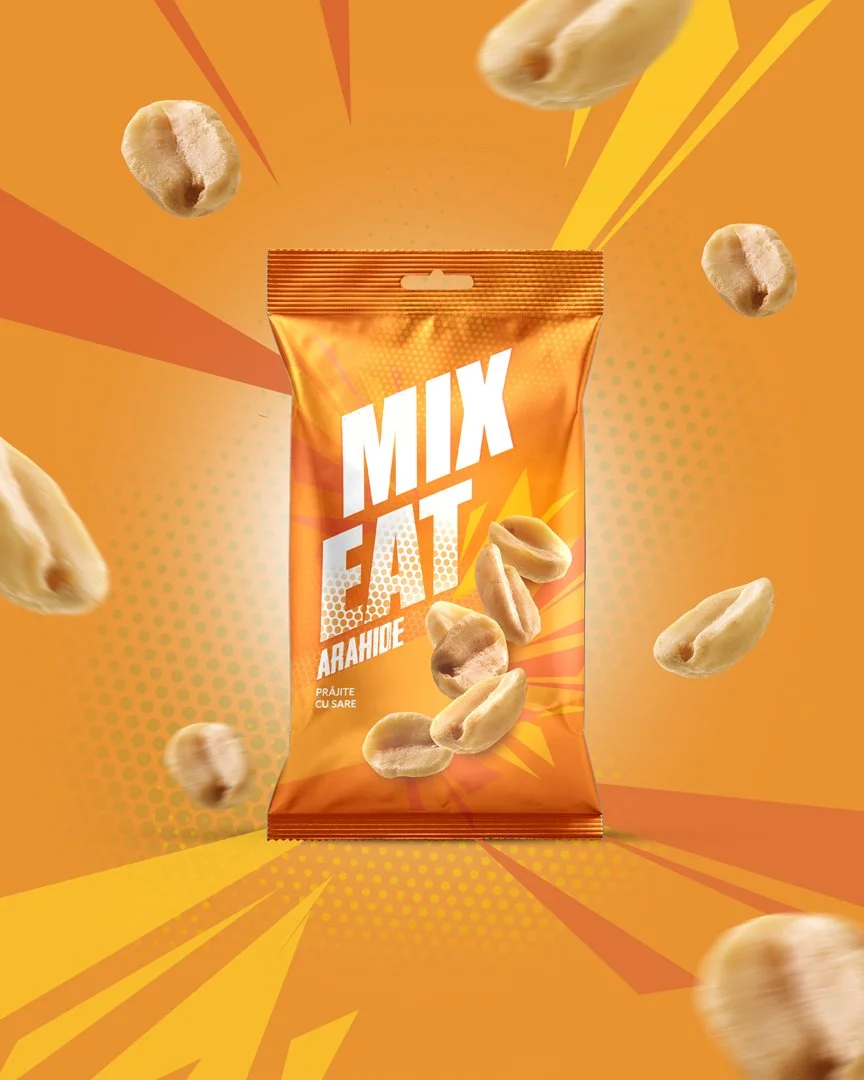
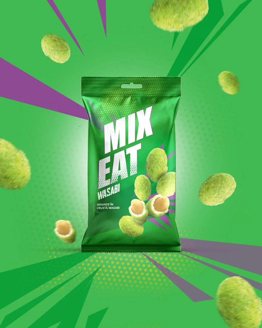
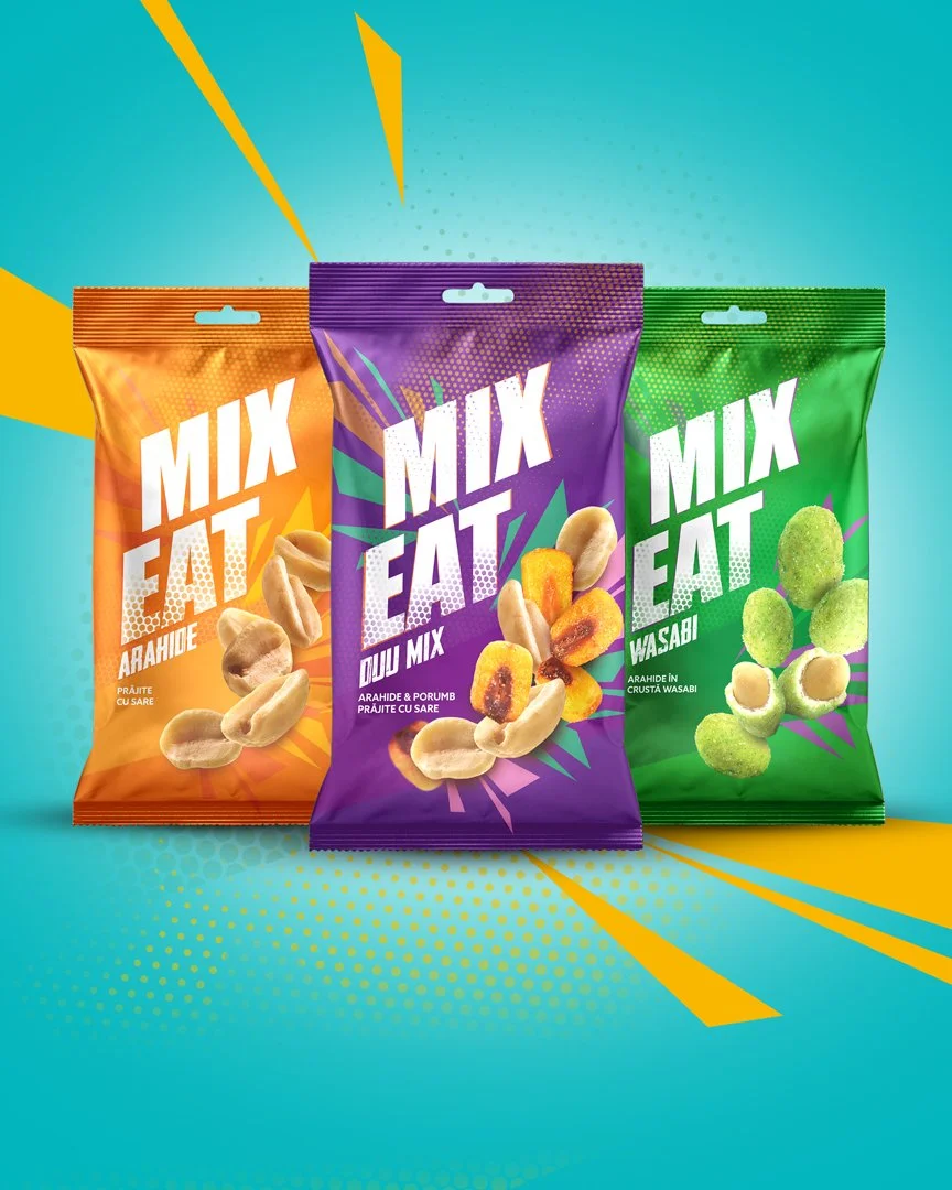
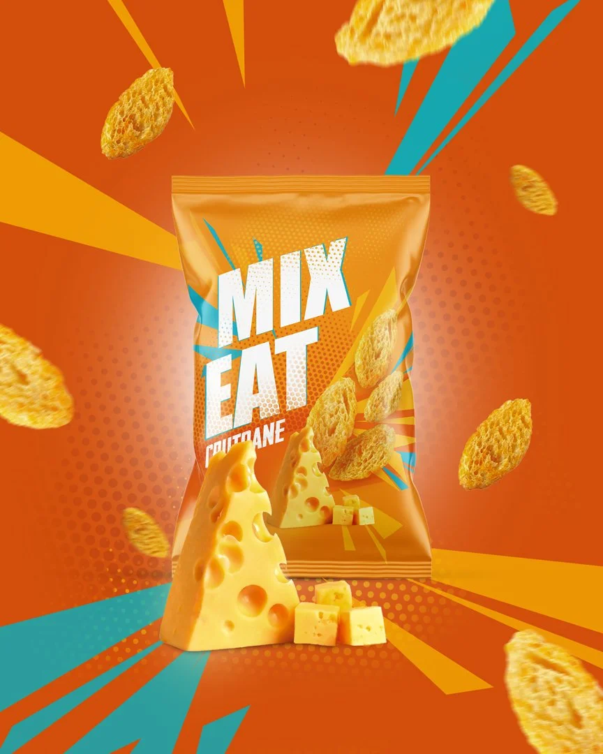
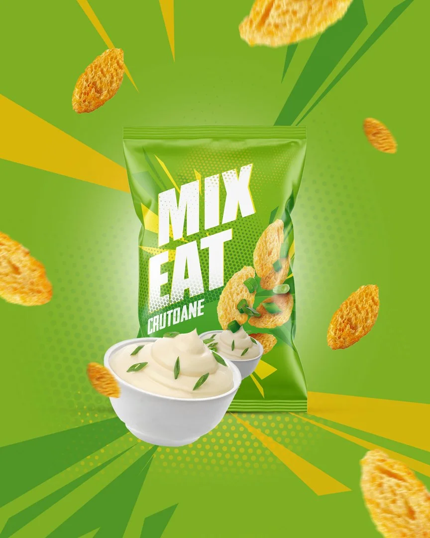
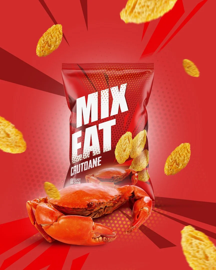
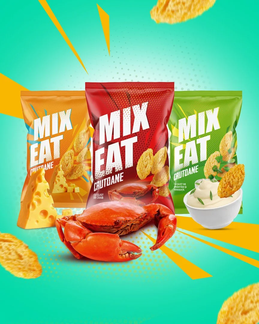
Packaging Design for “Mix Eat” Snacking Line
We developed a visual identity that merges bold colour accents with modern typography and illustrative elements. This combination creates a strong shelf presence and communicates the mix of flavours and energy inherent in every package. The design strikes a balance between clarity and expressiveness, ensuring that the product stands out without overwhelming the consumer.
The final design provides a memorable and engaging brand image, enhancing recognition and appeal in a competitive snacking category. By uniting vibrant visuals with a clear communication strategy, the packaging positions MixEat as a dynamic, contemporary choice for on-the-go snacking.